Excel
Using Excel for graphs
A commonly used application of ICT is the use of Excel software to create a table of results from an investigation and then use it to create a chart (graph). Here are a few tips for creating a line graph to represent continuous data.
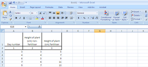
Enter the data so that the data for the x-axis is in the first column and the y-axis or dependent variable is in the second column. If two lines are required, for different treatments or experiments, then use an additional column. If, for example, students have measured the height of plants, some grown with fertiliser and some grown without and measured over three weeks, the first column would list the day number, the second column would be the height of the plants on each of the numbered days for the non-fertiliser and would have a heading ‘non-fertiliser’ and the third column would be the height of the plants for the numbered days grown with fertiliser and would have a heading ‘fertiliser’.

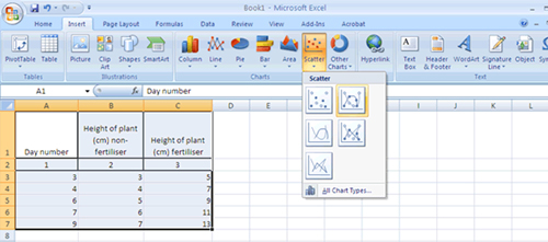
Highlight the columns and rows that you want for the chart and then click on ‘Insert’ and then, in the Charts group, click on the type of chart. If, in the above case, you want to include a legend with the graph for the fertiliser and non-fertiliser plants, make sure the headings are highlighted as well as the columns containing the data. Then for a line graph, SELECT a scatter (XY) plot. (There is a trap to avoid because line graph appears as an alternative, but it can only be used if the x-axis or horizontal scale is representing data on an even scale). In this data set the days when measurements have been taken are NOT evenly spaced. A range of types of scatter plots will appear. Click on the choice of the one you want (that is, do you want a line to connect the points or not, do you want the data points emphasised or just the line, do you want a straight or curved line to join the points?

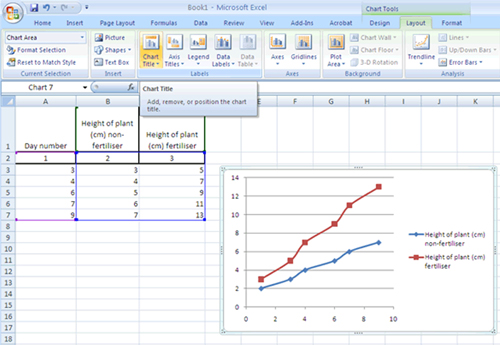
Students can go to the ‘layout’ tab to select ways they can improve communication by adding a title, axes titles and so on.
